Monday 31 March 2008

Movement and Composition in the Dore Dante Illustrations

Movement is one of the things I find the most difficult to suggest in a drawing, for the (possibly rather obvious) reason that the work is a static image. I've recently been looking at composition in Dore's illustrations, in particular for Dante's Inferno, in an attempt to figure out how the 19th century illustrator suggested movement in images that, because of their medium and manner of depiction, were heavily detailed.

A dissatisfaction with the engravings made from his drawings for early projects such as Gargantua and Pantagruel and Contes Drolatiques led Dore to train his own team of engravers. Of course, his own draughtsmanship improved over time as well. But I feel that many of his later illustrations lose some of their motion, as well as their energetic quality, precisely because they are more polished and finished than his earlier works. Despite this, several methods appear to be used in the illustrations intended to depict movement. In this post several illustrations from Dante's Inferno will be the subject of analysis.


The illustration seems almost to be split into two halves: the furies in the top half, and Dante and Virgil in the lower half. The two seem almost not to be completely connected, perhaps because the shape of the rock 'tower' in the background does not extend above the two poets. Only Virgil's raised hand, pointing to the furies, connects the two; the foot of the lowest fury disappears behind Virgil's hand. Perhaps in order not to draw attention to this overlap, the leg of the fury is somewhat faded, suggesting that the three flying figures to recede into the background.

But how far? At first glance the furies seem to be more or less the same size as Dante and Virgil (ie human-sized), but the manner in which they fade into the background, and the extent to which Virgil's pointing arm is foreshortened, suggest that they are further back than initially was apparent - I don't think this was deliberate; as I mentioned before, this particular illustration almost seems to be two compositions stuck together rather awkwardly. To give Dore the benefit of the doubt, we could argue that this was intended to suggest the erratic movement of the flight of the furies, bobbing up and down.

There is, however, a certain amount of movement here. First, the furies' bodies are tilted in one direction. Interestingly they move from right to left; it is generally thought that a composition that moves from left to right suggests faster movement, and perhaps progress (except in countries where writing moves from right to left; the two are related). Again, the decision that the Furies move in this direction may have been a conscious one, suggesting a certain amount of resistance to their clumsy, inelegant movements.

Second, and perhaps the more successful element of the image at conveying movement, is the mist in the background. Wisps of smoke are parallel to the furies, as though to speed along to their movement. Dore is here more successful at suggesting the movement within the group of figures rather than their journey; the detail of the wings causes them to appear static rather than flapping, but the angle and twist of the three figures suggests their writhing movement very well. It is because of this quality that this engraving remains among my favorite of Dore's Dante illustrations.


Note that this engraver (who has signed the illustration 'E. Sotain') has used less detail in an illustration depicting the punishment of the sorcerer, whose head is twisted around by malicious demons. Possibly for this reason, it seems to have been easier to convey movement in this composition, but there is a less finished look to the composition in comparison to many of the other illustrations in this set. Is movement therefore in expense to detail depicting texture, light and shadow? I don't know for sure, but there is undoubtedly more movement here than in the illustration of the furies.

Everything in the composition, save for the rock, forming the ground and the formation on the left, is in motion. As before, there is movement in the smoke in the background, adding chaos to the scene. The twisting, undulating shape of the smoke surrounding the sorcerer suggests that it is moving in a manner suggesting writhing snakes.

In the figures movement is suggested by shapes, lines and angles. The demons' forks' handles help to suggest the force applied, bowing as they lift the sorcerer, whose raised arm allows the curve of the topmost fork to be followed through into the line of his body. The twisting bodies of the demons also suggest the physical tension in the scene.


The illustration of sinners being chased by dogs through a gnarled forest is another good one for movement. Aside from the obvious factor of the running figures, I think movement is also suggested by the shape and angle of the trees; if they stood up straight, they would not complement the movement and speed of the running figures quite so well.


The movement in this illustration is suggested not only be the twist of the figures but by their position within the composition. The light falling on the figures causes a diagonal 'strip' to be highlighted across the composition. This is framed by curves formed in the foreground (the rocks in a darker shade) and in the background (the cliff over which the snakes spill). If this image were composed only of abstract light and dark shapes I think there would still be movement because of the shape and curve of these forms.


In this illustration, there is still contrast between light and shadow, but it does not produce overall shapes within the composition as distinctly as the previous illustration. However, this is successful at suggesting an atmosphere of complete chaos - movement is all over the place. Areas of concentrated shadow serve to pick out a few focal points, but they do not complement the movement.

Where Dore proves himself to be the most skilled is at drawing the human form; he is able to twist it into all sorts of forms to suggest force, strength and movement. It still amazes me (and very jealous) to learn that he never had any art training, and never drew from life. The theatrical manner in which many of the illustrations are lit often produces curving shapes of light and dark that complement the movement within a composition, whether sweeping, twisting or writhing.
Thursday 27 March 2008

Some Shameless Self-Publicity...

I forgot to mention From Book to Book, John McDowall and Chris Taylor's exhibition in Leeds City Art Gallery that began on March 6th and continues until April 20th. The books exhibited were made in response to books themselves. My book, 15 Uses for a Book (for dummies) is one of the books on display. I'll post something about 15 Uses a little later.

Sunday 23 March 2008

Hitch

Sir Alfred Hitchcock's appearance is almost as memorable as his films. I made several attempts to caricature Hitch in a manner reminiscent of New York caricaturist Al Hirschfeld, who always had the extraordinary ability to distill an individual into the simplest of essences, in only a few smooth, calligraphic lines. These drawings were made in late 2006/early 2007.


The first was based on a specific photograph, and it shows. There is too much simple 'drawing' and no 'caricature'. Nor is the likeness terribly strong.


The second - based on another photograph - was a bit of an improvement, but superficial parts such as the line of the hair are still the unnecessary focus (the decision to use straight lines was here a bad one, not fitting with the overall shape of the face), with too little effort to capture more than simply Hitchcock's appearance. Again, the eyes are too prominent - another failed attempt at heavy eyelids.


It was only with the third Hitch - which is still, I freely admit, far from perfect - that I felt I caught the 'essence' of Hitch rather than simply his appearance. Notably, this is the only one that was not based on a photograph. Not relying on a single image forced me to focus on the subject himself rather than a single representation of him. I finally managed to get the right character in the face, and, as with Hirschfeld, it turned out that the fewer lines, the better. The slightly pompous lower lip, the disdainful but lazy glance, and the haughty nostril all work best when shown in as simple a way as possible.

Friday 21 March 2008

More Grotesque Faces


These were primarily inspired by the drawings of Leonardo Da Vinci, and based on a few observational drawings done of unwitting pedestrians in the city centre.

Wednesday 12 March 2008

6,469,952 spots


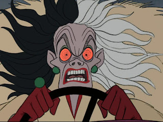
Disney have recently released the 'Special Edition' DVD of Disney's One Hundred and One Dalmatians in the UK. To me this is one of the most interesting of all of the Disney Animated Classics; though I all but ignored it as a child, and its reputation has been somewhat tarnished by countless remakes and spin-offs, I now consider it to be the best animated film the Disney studio produced after their Golden Age (from 1936's Snow White and the Seven Dwarfs to 1942's Bambi). No other Disney film succeeds in sheer force of style as much as One Hundred and One Dalmatians, which makes full use of its medium; the result is an extremely graphically strong film, with a rough, linear look that seems to complement the animation rather than attempt to convince the viewer that they are watching anything but a cartoon. It takes full advantage of aspects of its medium Disney had previously seen as obstacles to be defeated.

Much of the success of the film can be attributed not to Walt Disney (who was too busy with theme parks and television shows to attend many meetings on the film, only breezing in from time to time to leave annotations on story sketches) but Bill Peet, a 'story man' many at the studio felt was close in personality to Walt himself. Perhaps this is why the two didn't get on and eventually had a rather dramatic falling out. At any rate, Walt recognised Peet's skill at creating stories and, for the first time, gave only one man the job of writing and storyboarding a feature animated film.


One Hundred and One Dalmatians remains among the best written of all of Disney's features. The tendency towards excessive sentimentality and 'chocolate-box charm' (as one reviewer called it) found in many of the Disney films of the 1950s, and of the 1990s, is mostly dropped in favour of a more satyrical mood. As a result, the few moments of pathos are given greater gravity. An aspect of Dodie Smith's book which translates very well in the film is it's amusing reversal of roles. We see this right at the beginning of the film; the audience initially assumes that the narrator is Roger, the human, only to discover that the voice is that of his dog, Pongo, who considers Roger his pet.

References continue to be made to this throughout the film. I wrote in an earlier post of earlier Disney films, such as Pinocchio, depicting nature as inferior to humanity, a state which man descends to through primitive and uncivilized behaviour. In Dalmatians this is reversed, the story being told from the dogs' point of view; Nanny, the human with the closest affinity to the dogs, is one of the most sympathetic characters, while Cruella De Vil, the film's villainess, becomes more and more bestial and savage as her schemes unravel. Like earlier villains such as the Witch in Snow White and even Count Orlock in Nosferatu, Cruella has characteristics that make her a far more wild creature than any of the animals in the film. Her claws, bony frame, manic hair and posture all evoke the image of some sort of vulture or harpy. Her car is also given bestial characteristics, both in design and sound, roaring and growling in the film's climax.


I still consider Cruella, animated exclusively by Marc Davis, to be Disney's best villain. As has previously been mentioned, she possesses bestial qualities in both design and animation; despite this; she possesses a certain elegance. Character actress Mary Wickes performed live-action reference for the character, but Davis used the footage 'sparingly'. The character is a masterpiece of design, almost blurring the line between caricature and abstraction. Davis' skill at animating female characters shines through; he had been honing his skills throughout the 1950s, but it is in animating Cruella that he appears to have the most fun and exhibit the greatest skill. It is thought by many that the work of the animators known as the 'Nine Old Men' went into a decline in their later years; Cruella De Vil, Davis' final animation job, proves that at least one of them didn't experience such a decline.

It's interesting that Walt Disney himself hated the look of the film. I suppose if, as Ken Anderson (largely responsible for the style of the film) said, 'Walt hated lines', it's rather unlikely that he would have liked the film. Nevertheless, he did 'forgive' Anderson for the lines a few weeks before his death. Anyway, whatever Walt thought of it, I find it to be one of the best animated films ever to come out of his studio.

Sunday 9 March 2008

Gustave Dore's Dante Illustrations


This illustration, by Gustave Dore, depicts Satan imprisoned in the ice, in the centre of Hell, in Dante's Inferno. This illustration was not published, perhaps most obviously because Satan appears to be sitting cross-legged. Dante specifies that Satan's legs are sticking out of the other side of the hole he is 'plugging' at the centre of the earth.

The illustration by Dore that was published is more faithful to Dante's text, with Satan only visible from the waist up. A more chilling atmosphere (no pun intended) is created by the heavy use of shadow, with Satan receding into the darkness, and Dante and Virgil highlighted against it.

Dore's Inferno illustrations are his third most popular illustrations, released in more than 200 different editions. In first and second place are his Bible illustrations (700+ editions) and Don Quixote (300+). It is said that Jack Nicholson, in preparing for his role as the devil in The Witches of Eastwick, pored over Dore's Inferno illustrations in order to get into character. There was also a copy in the Disney library during the studio's golden age, and the influence can be seen in the mise en scene of certain sequences in Snow White and the Seven Dwarfs, Pinocchio and Fantasia.

An updated version of the Divine Comedy was released with text by Sandro Birk and Marcus Sanders and illustrations by Sandro Birk. The illustrations are direct responses to the Dore illustrations; the rocky, infernal world of hell is re-imagined as an urban landscape reminiscent of modern-day Los Angeles.


Birk's illustrations of Heaven in Paradiso are even more interesting, controversially alluding to Hinduism and Islam in the holiest of Heaven's denizens. My only complaint is that Birk's illustrations are drawings rather than etchings, not allowing for an emulation of Dore's style, which I feel would have reinforced the point a bit more. Nevertheless, I would definitely reccomend Birk and Sanders' Divine Comedy to any fan of Dante or Dore.

Thursday 6 March 2008

Tuesday 4 March 2008

Lemon-sucker


You may recognise this creature from The Consequences in Goya's Disasters of War. Here he is in a decidedly less profound context. Pen and ink. A2.